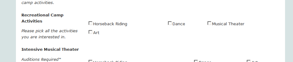
www.griersummer.org/registration/online
is my site form.
Depending on the number and size of the text in the check box value selections the value selections will align differently. Some look good, some need a bit of alignment to make them not so spread out and make them similar distance from each other or not wrap to the next line. See attached examples.
What will be the best way to do this? Do I need to adjust each check box separately or is there a global way?
I am aware that stetting size to 1 will make one column of the selections. But I'd like to see them horizontal.
Thanks.
Wally