- Posts: 125
- Thank you received: 4
Optimize Timeline Layout for Mobile Devices
- Alex
- Topic Author
- Offline
- Premium Member
-

Less
More
8 years 3 weeks ago #110709
by Alex
Optimize Timeline Layout for Mobile Devices was created by Alex
I'm looking for some CSS help to address a modification I wanted to make to the Timeline layout on mobile devices.
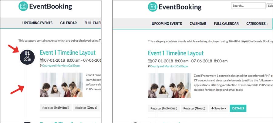
The Timeline layout look great on desktops but a little to squished when viewing on mobile devices as the Circled date and vertical line take up about 1/3 of the screen space on a phone, for example.
I was able to see this class affects the vertical line and width of the event info. If I disable the parameters the line goes away and width expands (see sample image):
This looks like the HTML code to make the circled date appear. Same thing here. If this is disabled the circled date disappears.
I tried messing with these in the custom css tab in the back-end but have not been successful. I'm also thinking the circled date is a custom HTML adjustment.
Thanks in advance for the help.
The Timeline layout look great on desktops but a little to squished when viewing on mobile devices as the Circled date and vertical line take up about 1/3 of the screen space on a phone, for example.
I was able to see this class affects the vertical line and width of the event info. If I disable the parameters the line goes away and width expands (see sample image):
Code:
.eb-event-container {
background-image: url(../images/dot-ver.png);
background-position: 42px 85px;
background-repeat: repeat-y;
margin-top: 0;
padding: 0 0 0 100px;
}
This looks like the HTML code to make the circled date appear. Same thing here. If this is disabled the circled date disappears.
Code:
<div class="eb-event-date-container">
<div class="eb-event-date btn-inverse">
<div class="eb-event-date-day"> 01 </div>
<div class="eb-event-date-month"> Ju </div>
<div class="eb-event-date-year"> 018 </div>
</div>
</div>
I tried messing with these in the custom css tab in the back-end but have not been successful. I'm also thinking the circled date is a custom HTML adjustment.
Thanks in advance for the help.
Please Log in or Create an account to join the conversation.
- Tuan Pham Ngoc
- Offline
- Administrator
-

8 years 3 weeks ago #110712
by Tuan Pham Ngoc
Replied by Tuan Pham Ngoc on topic Optimize Timeline Layout for Mobile Devices
Hello Alex
Could you please make a screenshot showing us how you want it to be displayed in mobile device? And maybe sending us super admin account of your site and link to the page, I will have my template developer to look at it to find a solution for the problem
Regards,
Tuan
Could you please make a screenshot showing us how you want it to be displayed in mobile device? And maybe sending us super admin account of your site and link to the page, I will have my template developer to look at it to find a solution for the problem
Regards,
Tuan
Please Log in or Create an account to join the conversation.
Moderators: Tuan Pham Ngoc
Support
Documentation
Information
Copyright © 2026 Joomla Extensions by Joomdonation. All Rights Reserved.
joomdonation.com is not affiliated with or endorsed by the Joomla! Project or Open Source Matters.
The Joomla! name and logo is used under a limited license granted by Open Source Matters the trademark holder in the United States and other countries.
The Joomla! name and logo is used under a limited license granted by Open Source Matters the trademark holder in the United States and other countries.