- Posts: 3
- Thank you received: 0
margin-left or padding-left problem
- Roberto Angioni
- Topic Author
- Offline
- New Member
-

Less
More
8 years 10 months ago #98878
by Roberto Angioni
margin-left or padding-left problem was created by Roberto Angioni
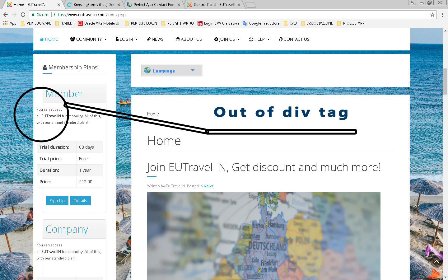
Goodmorning, i've got this little issue.
In the main page with the boxes-plan on the left sidebar, text and other element go on wrong starting position.
the domain is : www.eutravelin.com/
the same thing happens when you go to the details page. It seems to be a child element style to overwrite other div element style.
Instead in mobile wersion it works fine, no out if the way element or alignment.
Thank you and best regards
Please Log in or Create an account to join the conversation.
- Strofaria
- Offline
- New Member
-
Less
More
- Posts: 3
- Thank you received: 2
8 years 10 months ago #98879
by Strofaria
Replied by Strofaria on topic margin-left or padding-left problem
You should resolve adding this to your custom css file:
Code:
.osm-container .osm-item-description {
padding-left: 35px;
}
The following user(s) said Thank You: Tuan Pham Ngoc, Roberto Angioni
Please Log in or Create an account to join the conversation.
- Roberto Angioni
- Topic Author
- Offline
- New Member
-
Less
More
- Posts: 3
- Thank you received: 0
8 years 10 months ago #98881
by Roberto Angioni
Replied by Roberto Angioni on topic margin-left or padding-left problem
i've added the media query for mobile too
.osm-container .osm-item-description {
padding-left: 35px;
}
@media only screen and (max-width: 768px), only screen and (max-device-width: 768px) {
.osm-container .osm-item-description {
padding-left: 10px;
}
}
I'think it works better. thank you
.osm-container .osm-item-description {
padding-left: 35px;
}
@media only screen and (max-width: 768px), only screen and (max-device-width: 768px) {
.osm-container .osm-item-description {
padding-left: 10px;
}
}
I'think it works better. thank you
Please Log in or Create an account to join the conversation.
Support
Documentation
Information
Copyright © 2026 Joomla Extensions by Joomdonation. All Rights Reserved.
joomdonation.com is not affiliated with or endorsed by the Joomla! Project or Open Source Matters.
The Joomla! name and logo is used under a limited license granted by Open Source Matters the trademark holder in the United States and other countries.
The Joomla! name and logo is used under a limited license granted by Open Source Matters the trademark holder in the United States and other countries.